
Case Study — Design
Color Emoji (iOS 6.0)
June 2022
- Secrets of Emoji Design
- Anatomy of Emoji
- Dissection & Outlines
- Comparisons & Close-ups
- Side-by-Side Comparison
I remade the original emoji set in 2022 as vector-based emoji.
I’ve always loved Apple’s icon design. Their depth and precision is truly inspiring.
The set of original iOS 6.0 emoji are timeless & iconic. Their style set the standard for emoji design.
I wanted to take a look and see how the original emoji were made. If you try to blow emoji up to a large size, you’ll find they’re just images. The original designers have shared that they were digital paintings, but I wanted to see what I could do using vector alone.
Recently, I had just completed a similar case study on pushing the limits of vector shapes & gradients for UI design. That project equipped me with very delicate shading & composition techniques using only vector. I wanted to see how those same techniques could apply to the depth & detail of emoji design.
All of the emoji I created in this project are purely vector-based.
Disclaimer: I am not affiliated with Apple. Emoji referenced in comparisons are unmodified and used for educational purposes only. Close-ups & breakdowns are all my own work.
Assets produced:
56 Expressions
-
5Heads -
33Eyes -
18Eyebrows -
29Mouths-
3Teeth -
3Tongues -
2Cheek Blushes -
1Chin
-
-
12Accessories
21 Bonus
-
4People -
1Heart -
16Symbols
Tools used:
Secrets of Emoji Design

Which came first–the sun or the surprised face?
I was browsing the original emoji set looking for strong reference candidates. I noticed the shading for the body of the sun emoji was nearly identical to the body of the emoji face/head.
Rather than attempt an emotive emoji, I decided to use the sun emoji as my starting reference for breaking down the anatomy of the emoji face.
While I can’t unmask specifics around my techniques, I can share about the principles I used and my process behind breaking down Apple’s emoji design.
Light & Scene
Apple designers carry a strong understanding of physical-based light & scene composition.

Emoji take on studio-quality lighting, likely from a 3-point lighting setup (not pictured).
A strong light source seems to be positioned vertically above the emoji, casting a strong highlight on subjects. Fill & back lighting are used to create a sense of depth, reducing contrasting shadows while maintaining vibrancy.
A Word on the Physical Properties of Light
The light spectrum is a range of wavelengths.
These are broken into 3 categories:
- Infrared wavelengths, low energy, longer than red;
- Visible wavelengths, medium energy, between red and blue;
- Ultraviolet wavelengths, high energy, shorter than blue.
Notice the colors: red & blue.
When you shift colors, imagine the wavelengths of light.
You’re shifting more 🔴 red, or more 🔵 blue.
🔴 Red is lower energy and darker. 🔵 Blue is higher energy and brighter.
Object Composition
As previously mentioned, emoji were originally digital paintings. Objects don’t really follow shape-building principles like we’re used to seeing from Apple’s iconography.
With that said, their emoji are still highly compositional, with mostly-geometric shapes used to build objects.

Apple designers likely painted onto flat shapes to create depth and simulate light. They likely used a combination of layer effects as well as the trusty brush tool to create the final look.
My own technique reuses shape layers with gradients to construct depth out of as few vertices as possible. This to offload processing required by the CPU and relying on shaders to push intensive rendering work on the GPU.
Edges, Faces, & Bodies
In typical Apple style, much focus is placed on edge definition. Edges capture shape & form to create their signature sense of depth.
Edges & faces catch light to build definition.
Faces mold form and express physicality. These are material-based properties, like specular, diffuse, ambient; to portray things like roughness, glossyness, etc.
Bodies cast shadow and fill light-space for a sense of volume.

Blending & Gradients
The key to achieving the classic Apple emoji look is blending.
Understanding how physical light sources interact with materials and with one another is key.

Strong composition lays the foundation for vibrant blending work.
The classic approach of using a base, with layers of shading to create depth is how you produce strong results.
Take extra care of how you shape edges and faces against the scene lighting.

Anatomy of Emoji
Emoji rely heavily on strong principles of light & blending.
Lines take shape and mold form into the face base. Gradients capture depth from the light cast on the face surface.
Emoji can be broken into two main parts: face & expression.
Emoji Face Anatomy
The face is the foundation for all emotive emoji.

The emoji face is split into 5 layers:
- Highlight
- Flush
- Border
- Base
- Shadow
This anatomy is identical for all emotive emoji. This includes the 😡 Enraged Face emoji, which takes on a full-face flush. The base & border are only recolored for the two 😈 Smiling Face with Horns & 👿 Angry Face with Horns devil emoji.
For the original set, the only time the face changes form is for the 😱 Face Screaming in Fear emoji. It takes the shape of the 👽 Alien emoji, however, its anatomy remains the same.
Emoji Expression Anatomy
Expressions are built on top of the face anatomy.

An emoji expression consists of 5 layers:
- Accessories
- Eyebrows
- Eyes
- Mouth
- Face
Expressions reuse a set of anatomy, and combine other emoji anatomy to create unique expressions. Many eyebrows, eyes, & mouths are shared across multiple emoji.

Dissection & Outlines
My technique for creating these emoji is purely vector-based.
Everything is built out of shape layers with gradients. There are no layer effects or masks used in this project.

I didn’t use any brush-tricks or vectorization tools. Everything was either built from geometric shapes or by using the pen tool.

There may be inconsistencies in the vertex placements on the outlines
above due to the technique used to render the vertices. I split the line
into individual paths, then used open square
line-ends to create the vertices.
Comparisons & Close-ups
Below are some close-up comparisons of my emoji with Apple’s iOS 6.0 emoji.
A small reminder that my emoji are vector-based and Apple’s are pixel-based.


Side-by-Side Comparison
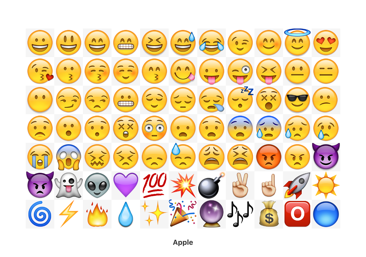
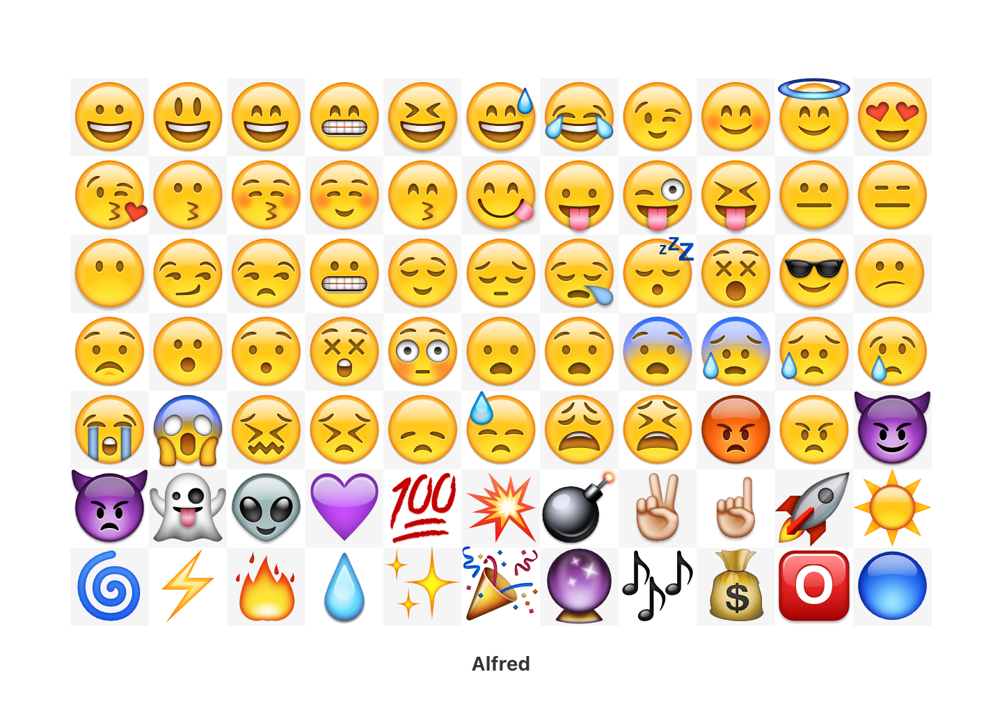
Use the slider above to compare my emoji (left) against the original Apple iOS 6.0 emoji (right).
For only using vector shapes & gradients–I think I got pretty close!
Looking back at them now, I see a few small things besides shading differences:
- The teeth should take on a shadow from the top lip;
- The devils’ eyebrows & eyes should be touching;
- And the flushed-blue faces should have dark-blue eyebrows.
Soo close! 😄
The sizes of the original Apple 😩 & 😫 emoji are slightly larger than all others for some reason–likely to accommodate their larger mouths. I left mine intentionally all an identical size.
In all, this was a fun project! My goal wasn’t to perfectly recreate the original emoji, just to see how far pure-vector could go. In the end, I learned a lot from Apple’s emoji design and got to see how far I could push my vector & gradient skills. 🖼️
Resources
Apple Color Emoji (iOS 6.0) Referenced
- ☀️ Sun, Emojipedia
- 😮 Face with Open Mouth, Emojipedia
- 👽 Alien, Emojipedia
- 😭 Loudly Crying Face, Emojipedia
- 😡 Enraged Face, Emojipedia
- ☝️ Index Pointing Up, Emojipedia
- 🎉 Party Popper, Emojipedia
📚 Book a meeting to view the .afdesign files. ➔
alfred.r.duarte@gmail.com Message